
Combining physical and UI design to support multi-book tracking and build readers’ social connections.
#
Product Design
#
Physical-Digital Interaction
#
UIUX Design
Problem
Reading in Isolation Reduces Initiative to Share and Engage
Readers often lose the initiative to spark meaningful conversations when they don’t know if others are engaging with similar ideas. Without visibility into each other’s reading journeys, moments of shared resonance fade before they’re expressed, weakening the potential for deeper relationships.
Concept
Turning Physical Reading into a Shared Experience
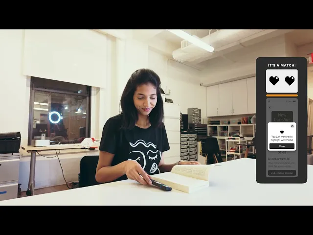
SMARK transforms the solitary act of reading into a connected experience with its companion-like form and smart functions, such as tracking multiple books' progress, highlighting, matching, and sharing quotes with friends in real time. This opens up space for ongoing dialogue and deeper connections.
Tools
Figma
Rhino 7
Adobe Photoshop
Team

Atisha Kudesia

Fiona Szeto

Ziheng Xu
Timeline
8
Months
CONTEXT
Digital platforms like Kindle and Goodreads add structure around reading—tracking progress, posting reviews—but they don’t change the core experience. Reading, especially physical reading, still happens alone, and shared discussions depend on intentional, often delayed coordination.
We saw this gap as an opportunity to design a more organic, real-time way for readers to connect around their shared experiences.

DISCOVERY
To ground this opportunity, we began by exploring how people read physical books today—how they track progress, manage multiple books at once, and share what they’re reading with others.


Through interviews with avid readers, three patterns consistently emerged.
Desire for Real-Time or Ongoing Sharing
Many readers want to share highlights, thoughts, and reflections during the reading process rather than waiting until a book is finished. This stems from the need to exchange ideas while they are fresh and to foster connection with partners or friend, even when reading separately.
Challenges in Tracking and Resuming Reading Progress
Manual progress tracking (e.g., bookmarks, spreadsheets, highlighter strips) is seen as tedious, and forgetting where they left off—especially in non-fiction—disrupts the reading flow. There is a need for tools that automatically capture reading progress and make it easy to resume.
Combating Isolation and Maintaining Motivation
Readers seek features that provide companionship, motivation, helping them stay engaged without sacrificing their preferred quiet or solo reading style.
Together, these insights revealed that on top of the features existing platforms already provide, readers were missing a way to share the experience of reading itself. This realization became the anchor for our ideation and design process.
IDEATION & DESIGN
And so we asked:
How might we create moments of connection and companionship, while still supporting core needs like progress tracking?
We explored a range of hypotheses and solution directions around this question, then mapped them using an Impact vs. Complexity framework.


This reveals a small set of features that could deliver high emotional and social impact without introducing unnecessary technical complexity.


DESIGN DEVELOPMENT
These priorities informed our first functional prototype.


However, after an internal team critique, we were dissatisfied with how it performed in practice. Several issues became apparent:
The button placement limit users who are not right-handed.
The screen size was too slim and small for any text to be readable.
The physical form did not inform users that it has the ability to scan highlights.
The USB connector/function did not align with our design goals.
Using this feedback, we iterated on the design and developed a second prototype, which we then brought into user testing.
TESTING & ITERATION
During testing, we evaluate how well the hardware and software integrate, including assessing ergonomics (button placement, size), portability, and physical intuitiveness, alongside UI readability, UX writing clarity, and the effectiveness of visual cues in informing and guiding users.


From these sessions, we synthesized our findings into insights that guided a series of targeted iterations. Each change was aimed at making interactions feel more intuitive and better aligned with the quiet, companion-like role SMARK was meant to play.


OUTCOME